More work Websites
A company website, and a redesign concept
A one-page public site for a property management and development company — launched in September 2026 — and a later redesign explored as a concept. The redesign has not been released; the live site is unchanged.
The live site
A single page that says who the company is, what it does across development, operations and stewardship, and how to reach it — fast, accessible and readable on a phone. Legacy links from the previous site were preserved so nothing broke for existing visitors.
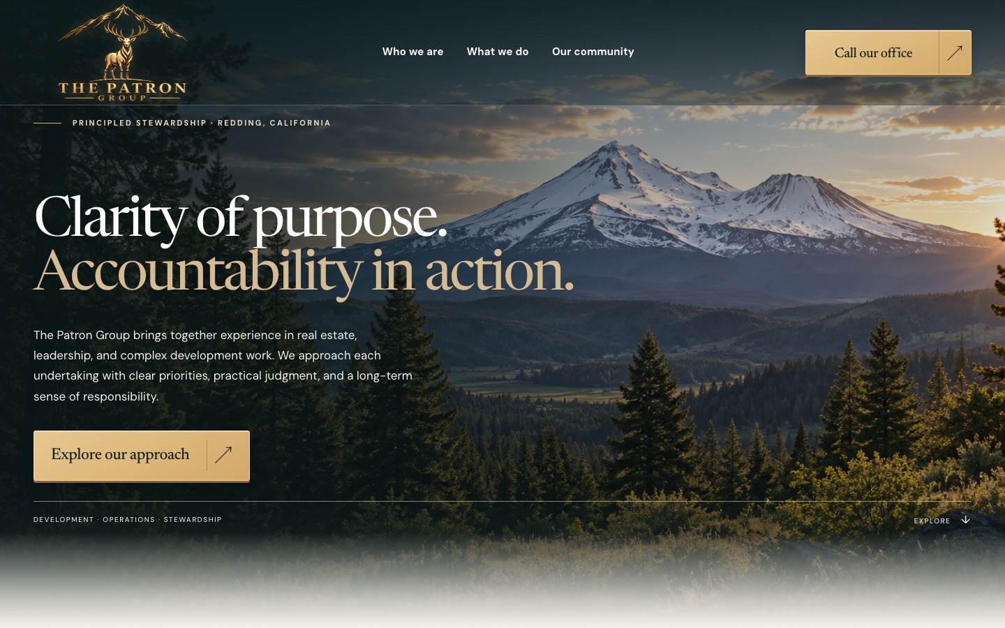
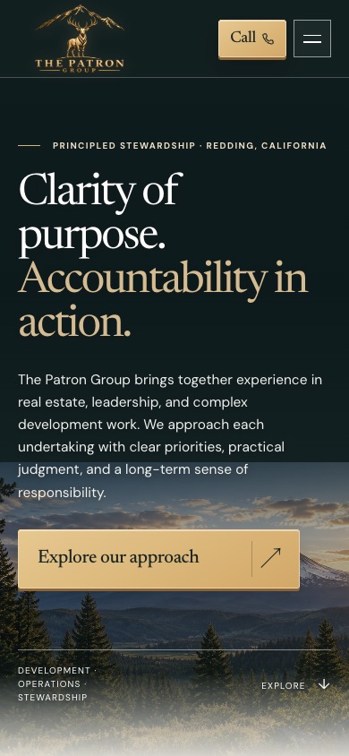
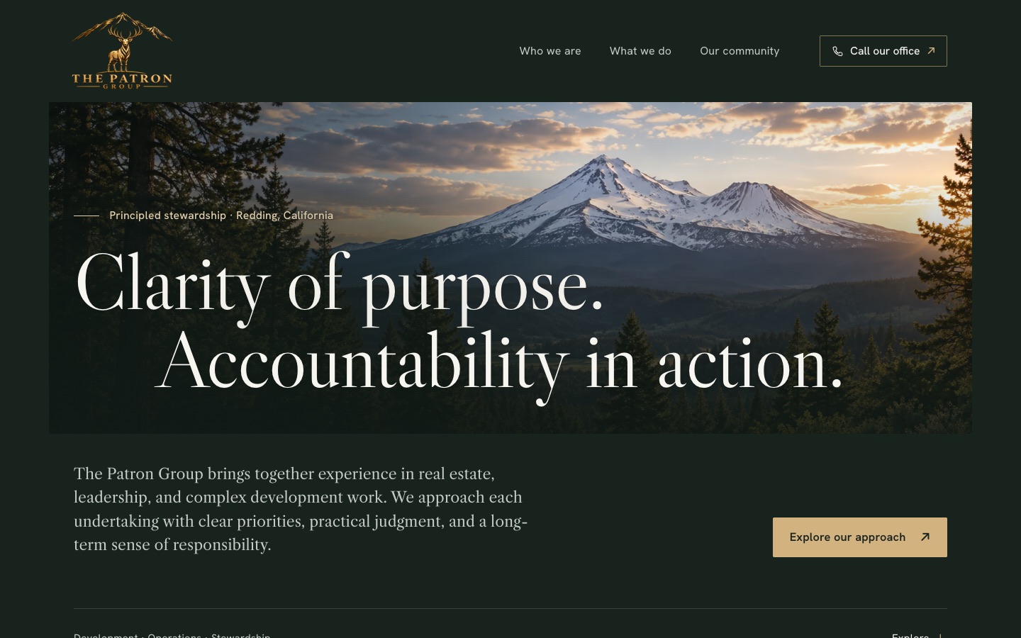
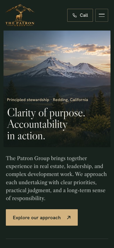
Redesign concept Concept — not released
Same words, a more established presence. Three directions were weighed: a tidied version of the current look (rejected as the most common "luxury" template), a white gallery layout (rejected: the metallic logo reads weaker on white), and the chosen "mountain estate in print" — the landscape framed like a print, deep green and snowfield tones from the company's own setting, bronze kept to fine rules and labels, and a classic serif for headlines.
Checked before review: wording identical to the live page, logo pixel-exact, automated accessibility checks clean from phone to wide desktop, and readable contrast over the illustration. Kept as a concept for a future website decision.
My part
Direction, content and review decisions; the build and checks were carried out by AI assistants under that direction.